Pricing
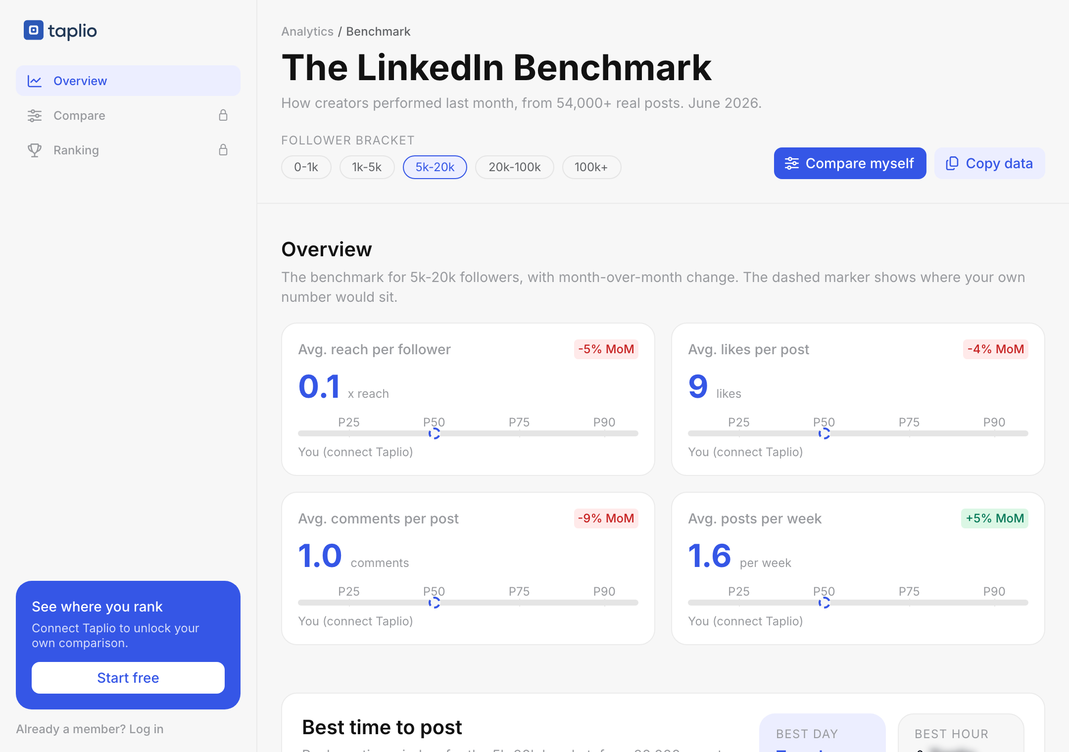
Every month we measure 54,000+ real posts from real creators and turn them into one benchmark. Where the median sits in your follower bracket, what the top 10% do differently, and which formats are actually pulling their weight right now.
Free. One email, no password, no credit card.
All of it free, for every follower bracket from under 1,000 to over 100,000. Pick your bracket and the whole benchmark reflows to the people you are actually comparable to.
Five follower brackets, each with its own distribution. A 2% engagement rate means something very different at 800 followers and at 60,000.
Not a single average. Reach per follower, likes, comments and posts per week, each with the full spread from a quiet month to a top-decile one.
Every metric carries its change versus last month, so you can tell a personal dip from a platform-wide one before you rewrite your strategy.
Image, video, document and text only, ranked on reach and on engagement. The spread between the best and the worst is wider than most people assume.
Five length bands in characters, each with its median reach and engagement. There is a clear direction in the June data, and it surprises most people.
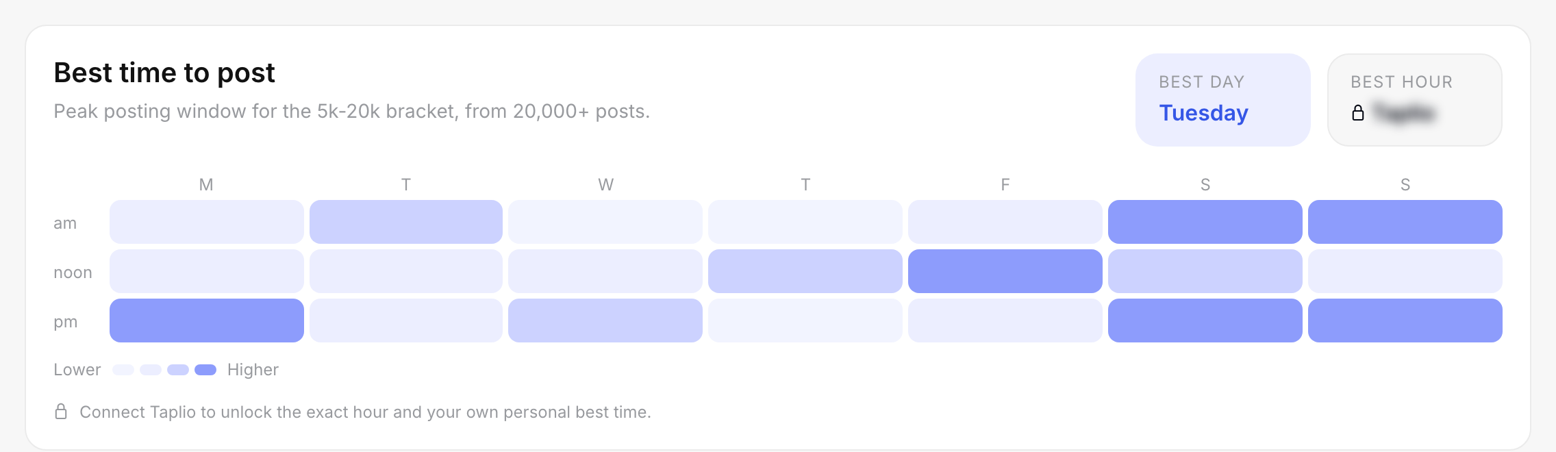
We record the day and the hour of every post we measure, which gives 168 slots a month. The benchmark shows the peak window for your bracket.
The regular benchmark only shows you follower cohrots. Go even further by connection your Taplio account! Compare yourself to people in your niche from your own country.




Connecting Taplio is optional and free to start.
We are not going to pretend these are secrets. They are just measured, on a sample big enough that they stop being anecdotes.
And it is not the one the advice threads keep recommending. Same month, same sample, split by what was attached to the post.
The curve does not go the way you would expect. There is a bracket where engagement peaks, and it is not the biggest one.
If your numbers fell last month, this is the first thing to check before blaming your content. It may not have been you.
Takes about ten seconds. You keep access on this browser afterwards.
That is the whole gate. No password, no credit card, no Taplio account required. You also get the new edition each month, and one click unsubscribes you.
Everything reflows to that cohort. This is the step most people skip, and it is why they end up comparing a 900-follower account to platform-wide averages.
Optional. Your own marker appears on every distribution, with your exact percentile and your personal best posting slot.
Every other LinkedIn benchmark measures brand pages. This one measures personal profiles, which behave differently on reach, on formats and on posting rhythm. If you post from your own name, the usual B2B benchmarks describe someone else.
A handful of viral posts drags any LinkedIn average upward. Compare yourself to a mean and you will feel behind while sitting above half the platform. We publish p25, p50, p75 and p90 for that reason.
54,000+ real posts, a fresh sample each edition, not a report from two years ago that everyone keeps citing. A bad month on the platform shows up as a bad month in the data.
Current edition: June 2026. Engagement rate is reactions plus comments divided by impressions.
A monthly measurement of 54,000+ real LinkedIn posts from personal profiles, broken down by follower bracket, content format, post length and posting slot. Instead of one platform-wide average, it publishes the full distribution, so you can see the p25, p50, p75 and p90 for each metric and find where you land.
Yes. The whole benchmark opens with an email address. No password, no credit card and no Taplio account. Connecting a Taplio account is optional and adds your own numbers on top of the cohort charts.
Two reasons. It lets us send you the new edition each month, which is when the benchmark is most useful. And it keeps the data attached to a person rather than to a scraper. One email a month, one click to unsubscribe.
It depends entirely on your follower count, which is why a single platform-wide figure is misleading. The benchmark gives you the median and the top-decile threshold for your own bracket, so you can see whether you are in the normal range or in the top quarter of comparable creators.
Most of them measure company pages. This one measures personal profiles, which behave differently on reach, formats and posting rhythm. If you post under your own name, the usual B2B benchmarks are describing a different game.
Every month, on a fresh sample of 54,000+ posts. Each edition also shows the change versus the previous month, so you can separate a platform-wide shift from a change in your own content.
Not to read the benchmark. Only if you want your own numbers plotted on the cohort charts, and that access is read-only. We never post on your behalf.
54,000+ posts, five follower brackets, one benchmark.
Free, updated monthly.